39 2nd Street
Presque Isle, Maine
Telephone: (207) 764-2571
Toll Free: (866) 758-4480
Fax: (207) 768-5756
EST. 1908
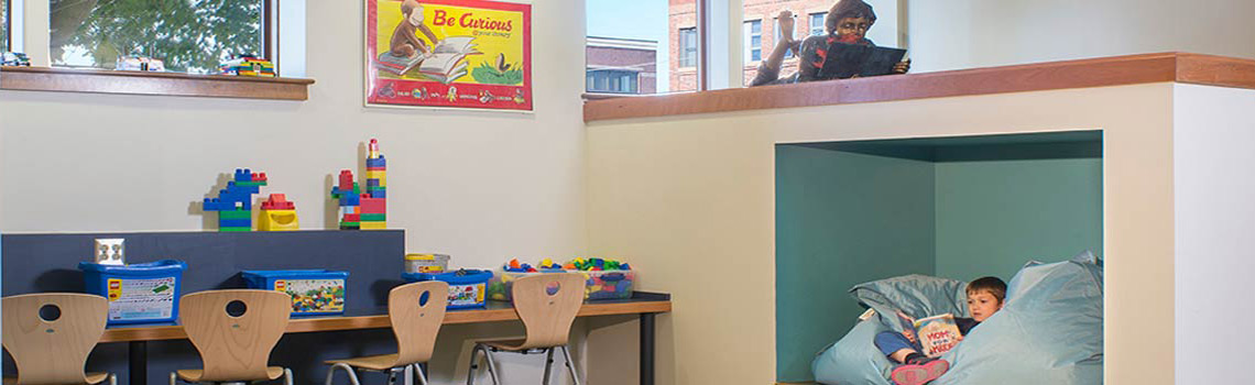
Reading Nook
Photo by Magnus Stark
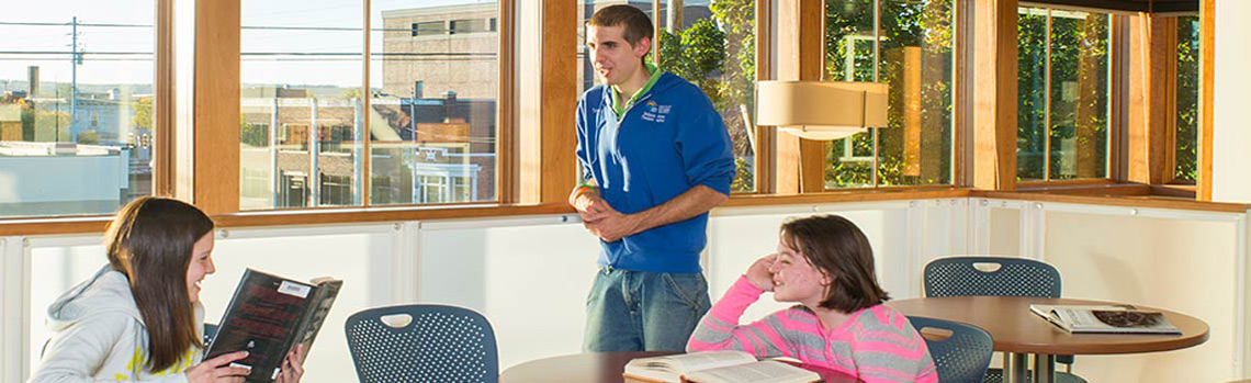
Cafe
Enjoy your snack in our cafe.

Storytime
A regular favorite for all ages

Get Your Library Card
At anytime, checking out materials is fast and easy.


Online Catalog
What's Coming! What's New! What's Hot!
FAQ's
Get your questions answered!
Maine Infonet
Maine Libraries. Maine Citizens. Connected.
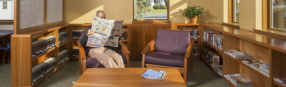
Classical Tour
Delve into our classical collection
Maine Infonet
Download Library
Digital Maine Library
Maine's Virtual Library
Obituary Index
Digital Archives
of the Mark and Emily Turner Memorial Library
Your template comes with a host of Color Choosers and background image options allowing you total control of the look and feel of your site. Simply navigate to Extensions -> Template Manager -> [YourTemplate] to access the full range of easy to use styling options to give your template your very own look to suit your website.

Your template comes with a host of Color Choosers allowing you total control of the look and feel of your site. Simply navigate to Extensions -> Template Manager -> [YourTemplate] to access the full range of easy to use Colour Choosers.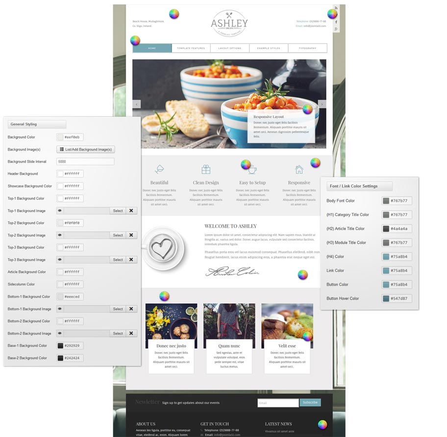
 As well as the many color choosers which allow you to customize each element of your template, this template also allows you to edit the background image visible in the header, slideshow and bottom module positions from within your templates parameters.
Using the corresponding field under the Styling tab of your templates parameters hit the 'Select' button to access your Media Manager. From here you can upload the header background image of your choice directly from your computer. You can also remove this image and replace it with the color of your choice
It is also worth remembering that Joomla allows you to create multiple template styles which can then be applied to the menu items of your choice. This gives you full control of setting different backgrounds on different pages throughout your site.
It has become common knowledge that every day the number of mobile devices used to view your site grows. Responsive design gives your site the power to provide an optimal viewing experience across a wide range of devices from a mobile phone to a desktop computer monitor.
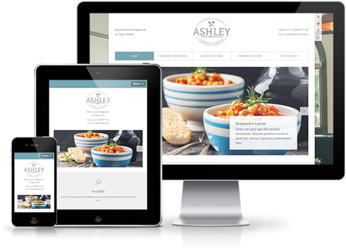 So how does it work? With the use of media queries different CSS style rules are loaded depending on characteristics of the device your site is been viewed with, most commonly the width of your browser. With each set of rules your site will be styled to best display on the matching device.
At Joomla51 we have embraced this new trend in website design and implemented responsive design to all our new releases, resolving any problems assoiciated with how your site will display on smaller resolution screens. To view how your template will respond to each screen resolution simply resize your browser window, as you reduce the width of your browser the template will react accordingly, altering its layout and style to best accomodate the site content within the available viewing area.
Alongside its responsive design, the template features a number of options within its parameters allowing you control over what content is displayed on smaller mobile devices. From your Joomla administration navigate to Extensions -> Template Manager -> J51_[YourTemplate] -> Responsive Options, here you will find a number of toggle switches to turn on/off each set of modules. If there is a situation where you would sooner your site to display the same on all devices then not to worry as we have added an option here to do that to (“,).
This template comes with different module styles and icons. For each module you can pick a style and combine it with an icon creating your own unique look.
You can set your module style via the Module Class Suffix field within your modules parameters. Navigate to Extensions -> Module Manager -> [YourModule] -> Advanced Options -> Module Class Suffix.
Heading1 (h1) looks like this
Lorem ipsum dolor sit amet, consectetuer adipiscing elit, sed diam nonummy nibh euismod tincidunt ut laoreet dolore magna aliquam erat volutpat. Ut wisi enim ad minim veniam, quis nostrud exerci tation ullamcorper suscipit lobortis nisl ut aliquip ex.
Heading2 (h2) looks like this
Lorem ipsum dolor sit amet, consectetuer adipiscing elit, sed diam nonummy nibh euismod tincidunt ut laoreet dolore magna aliquam erat volutpat. Ut wisi enim ad minim veniam, quis nostrud exerci tation ullamcorper suscipit lobortis nisl ut aliquip ex.
Heading3 (h3) looks like this
Lorem ipsum dolor sit amet, consectetuer adipiscing elit, sed diam nonummy nibh euismod tincidunt ut laoreet dolore magna aliquam erat volutpat. Ut wisi enim ad minim veniam, quis nostrud exerci tation ullamcorper suscipit lobortis nisl ut aliquip ex.
Heading4 (h4) looks like this
Lorem ipsum dolor sit amet, consectetuer adipiscing elit, sed diam nonummy nibh euismod tincidunt ut laoreet dolore magna aliquam erat volutpat. Ut wisi enim ad minim veniam, quis nostrud exerci tation ullamcorper suscipit lobortis nisl ut aliquip ex.
Heading5 (h5) looks like this
Lorem ipsum dolor sit amet, consectetuer adipiscing elit, sed diam nonummy nibh euismod tincidunt ut laoreet dolore magna aliquam erat volutpat. Ut wisi enim ad minim veniam, quis nostrud exerci tation ullamcorper suscipit lobortis nisl ut aliquip ex.
<pre> or <div class="code">
To display note use: <p class="note">Sample of your note !</p>
To display pin note use :<p class="pin">Sample of your pin note !</p>
To display clip note use:<p class="clip">Sample of your clip note</p>
To display download note use:<p class="down">Sample of your download note</p>
Ordered List
- Lorem ipsum dolor sit amet consectetur
- Lorem ipsum dolor sit amet consectetur
- Lorem ipsum dolor sit amet consectetur
Un-Ordered List
- Lorem ipsum dolor sit amet consectetur
- Lorem ipsum dolor sit amet consectetur
- Lorem ipsum dolor sit amet consectetur
Un-Ordered List witch class="tick"
<ul class="tick"><li>Your list item goes here!</li></ul>
- Lorem ipsum dolor sit amet consectetur
- Lorem ipsum dolor sit amet consectetur
- Lorem ipsum dolor sit amet consectetur
Un-Ordered List witch class="star"
<ul class="star"><li>Your list item goes here!</li></ul>
- Lorem ipsum dolor sit amet consectetur
- Lorem ipsum dolor sit amet consectetur
- Lorem ipsum dolor sit amet consectetur
Un-Ordered List witch class="plus"
<ul class="plus"><li>Your list item goes here!</li></ul>
- Lorem ipsum dolor sit amet consectetur
- Lorem ipsum dolor sit amet consectetur
- Lorem ipsum dolor sit amet consectetur
Blockquote
<blockquote><p>Your list item goes here!</p></blockquote>
Lorem ipsum dolor sit amet, consectetuer adipiscing elit, sed diam nonummy nibh euismod tincidunt ut laoreet dolore magna aliquam erat volutpat.
Emphasis Tags
<em class="highlight black">your text</em>
An emphasis tag that allows you to highlight some text in black.
<em class="highlight blue">your text</em>
An emphasis tag that allows you to highlight some text in blue.
<em class="highlight red">your text</em>
An emphasis tag that allows you to highlight some text in red.
<em class="highlight green">your text</em>
An emphasis tag that allows you to highlight some text in green.
<em class="highlight yellow">your text</em>
An emphasis tag that allows you to highlight some text in yellow.
Image Frames
<img src="/images/yourimage.jpg" class="frame-1"/>

<img src="/images/yourimage.jpg" class="frame-2"/>
Easily adjust your templates widths and column layout via the Layout Options section of your templates parameters which can be accessed by navigating to Extensions -> Template Manager -> J51_YourTemplate.
Set you template width using the appropriate field in pixels. By default this is set to 1080 which sets your template width to 1080px.
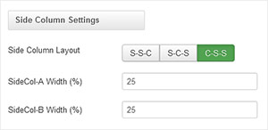
From your 'Side Column Layout' buttons simply set the layout of your side columns in relation to your site content with options for both your side columns to appear on either the left or the right or on either side of your content/component area.
For a single column layout simply disable all modules in the sidecol-a and sidecol-b module positions.
Your side column widths can also be customised via this section. Place the desired width of your side column by percentage in the Side Column Width field. Your content area will automatically contract/expand to fill the remaining available area.
There is a total of 6 color styles available giving your the template flexibility in match the color scheme best suited to your needs. Color styles available are Black, Red, Blue, Green, Bronze and Purple and can be set by navigating to your templates parameters (Extensions -> Template Manager -> J51 [Template Name] and simply selecting the color style of your choice from the 'Template Style' dropdown menu.

With a new and improved template parameters we have combined some of the most used and asked for features within an easy to use and beautifully styles interface. With these parameters you can now quickly customise your template to your own needs and have your site up and running in a matter of minutes.
Your template parameters can be access directly from your Template Manager giving you access to a host of features including a selection of template styles, some colour choosers to help customise your template headers and links, a number of layout options and easy to use logo settings.
There is a total of 56 available module positions all of which are fully collapsible. By default your module widths will automatically adjust depending on the number of modules published within its containing row however within the templates parameters you can disable this feature and customise the width of each individual module.
Book Club
Poppy Fields
By
Nikki Erlick
May 6, 2026
@ 6:00 PM

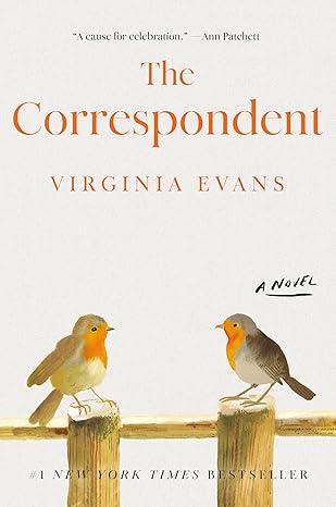
The Correspondent
By
Virginia Evans
June 3, 2026
@ 6:00 PM
Theo Of Golden
By
Allen Levi
July 1, 2026
@ 6:00 PM

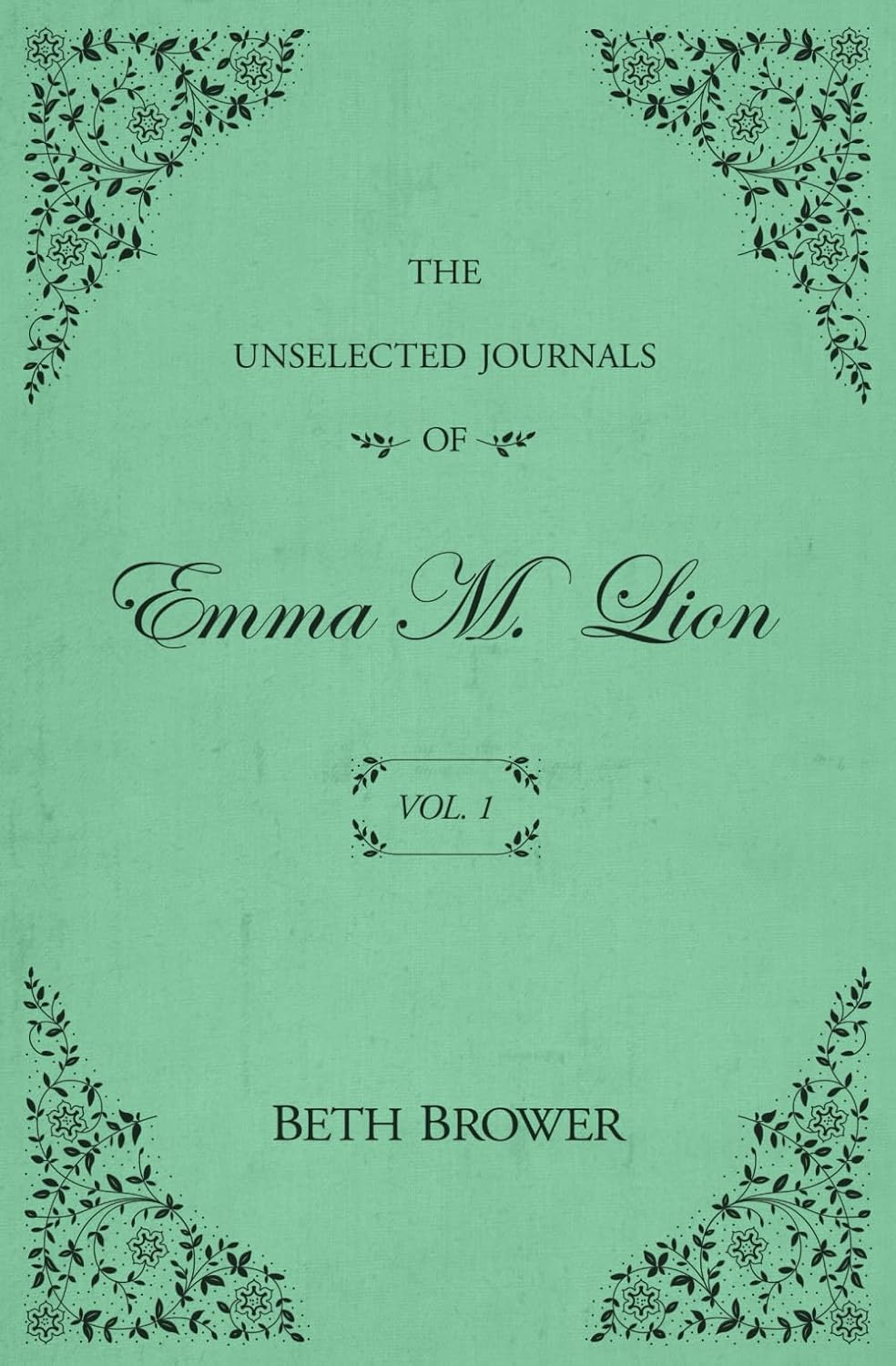
The Unselected Journals Of Emma M. Lion Vol.1
By
Beth Brower
August 5, 2026
@6:00 PM
Fire Exit
By
Morgan Talty
September 2, 2026
@6:00 PM

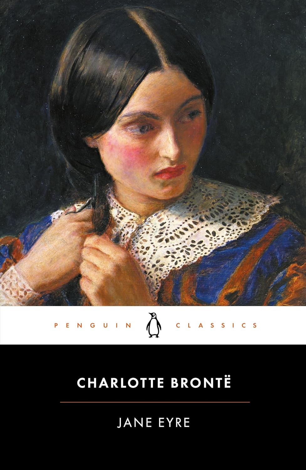
Jane Eyer
By
Charlotte Bronte
October 7, 2026
@ 6:00 PM
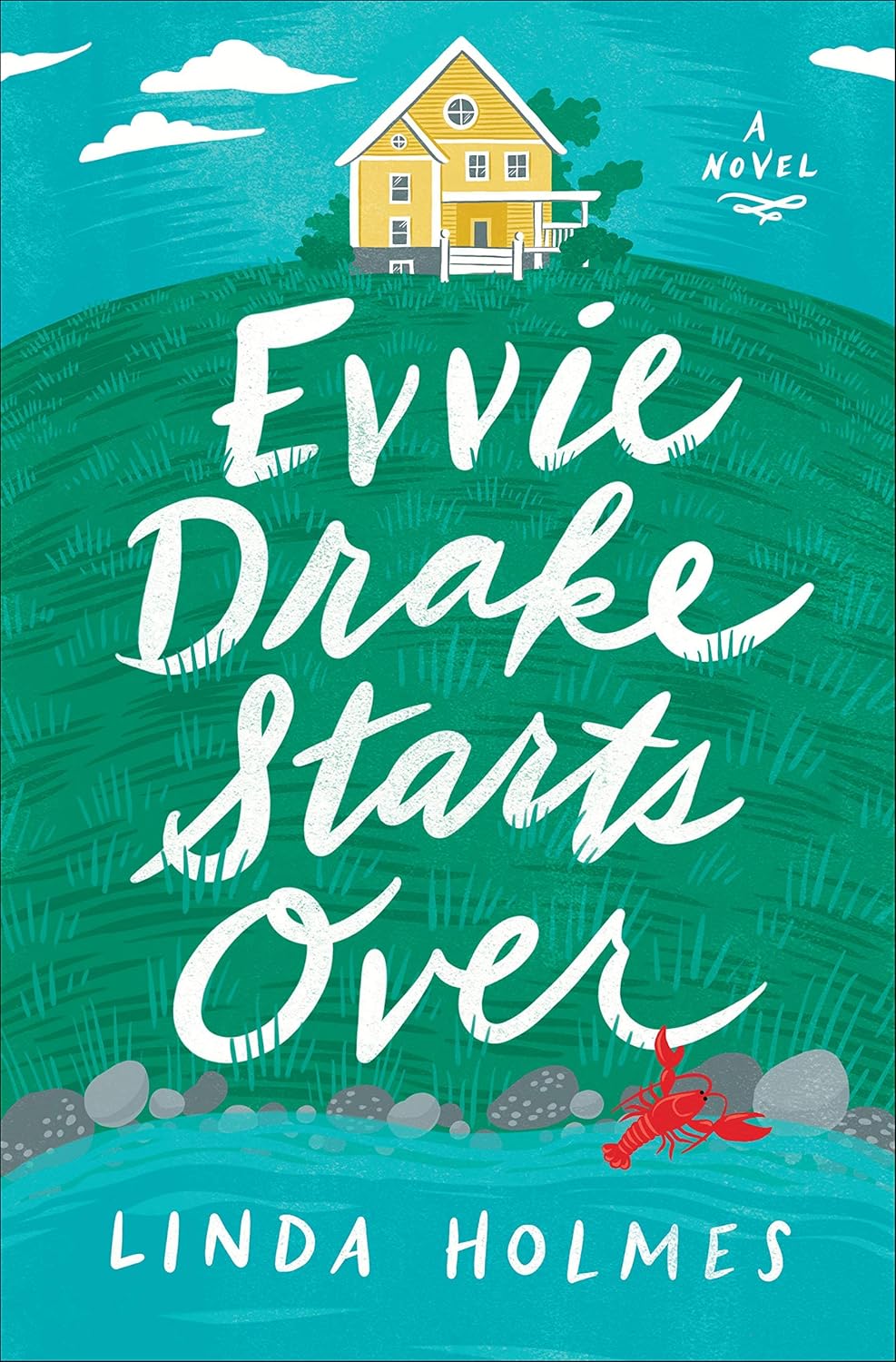
Evvie Drake Starts Over
By
Linda Holmes
November 3, 2026
@6:00 PM
Winter Solstice
By
Rosamund Pilcher
December 2, 2026
@ 6:00 PM

To Catch A Thief
LIBRARY THIRD FLOOR SCREENINGS
Feature Film Presentation Friday

March 6, 2020
See you all tonight at 7 pm 3rd floor Presque Isle Library! Refreshments... See you there.
November 1st…At Third Floor Classic Film Presentation
Cinemascope Screening Room here at
the Mark and Emily Turner Memorial Library in Presque Isle, Maine 04769
March 6th AT 5 PM FIRST FRIDAY…..
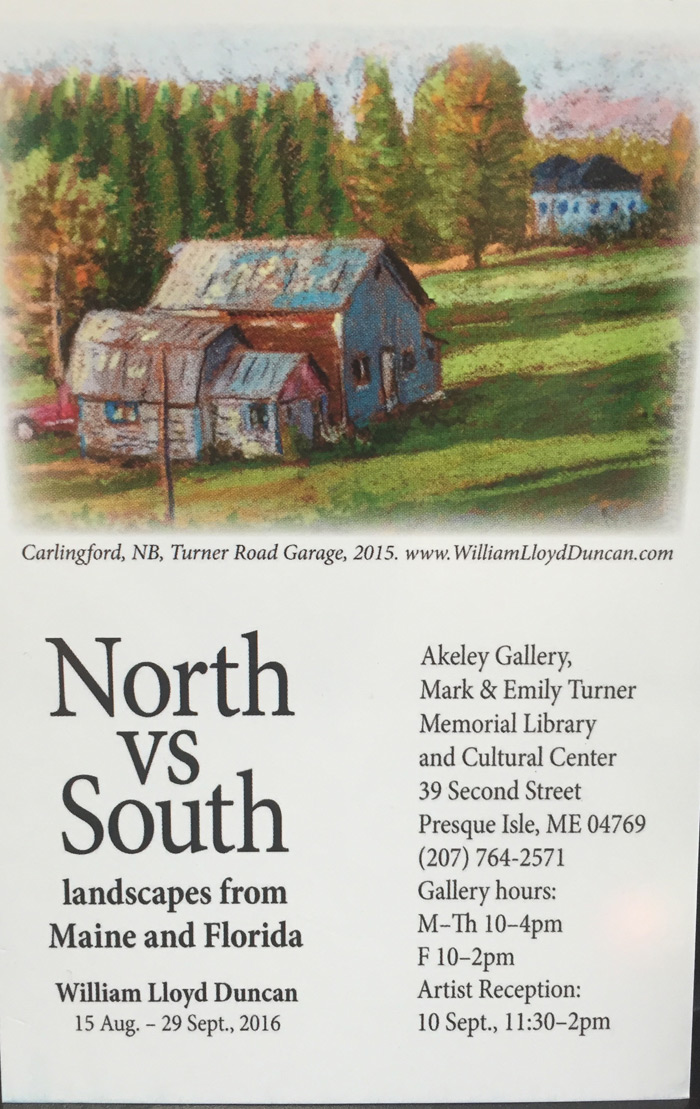
2nd Floor Introducing Wayne Kennard and his Stain Glass Windows in our New “ GLASS GALLERY”
"A TOUCH OF GLASS"
STUDY AND DISCUSS with Clifton “EVELYN PORTER paintings in our Presque Isle Memorial Mark and Emily Turner Library Reading Room.
Showing in our Akeley Gallery “Aroostook Paintings” with Tammy Dube...
and
At 7 o’clock Third Floor feature Film Screening a special edition of Alfred Hitchcock’s American expatriate John Robie, living in high style on the Riviera, is a retired cat burglar. He must find out who a copycat is to keep a new wave of jewel thefts from being pinned on him. High on the list of prime victims is Jessie Stevens, in Europe to help daughter Frances find a suitable husband. The Lloyds of London insurance agent is using a thief to catch a thief. Take an especially close look at scene where Robie gets Jessie's attention, dropping an expensive casino chip down the décolletage of a French roulette player.
"TO CATCH A THIEF” 1955 CLASSIC
WITH CARY GRANT AND GRACE KELLY
refreshments of course and stereo wide screen experience for us!
Best Clifton Boudman
7:00pm to 9:00pm
On the 3rd Floor
At
Mark and Emily Turner Memorial Library and Cultural Center
39 Second Street, Presque Isle, Maine 04769
Questions Call (207)764-2571